

The most polished example of physiotherapy website design may be the wrong fit for your clinic. A template can look professional yet leave patients unsure which services you offer, whether you’re the right fit or how to get in touch. Good design is more than a clean colour palette. It makes the next step clear.
It’s useful to compare how websites look, but appearance alone won’t tell you whether patients can find the right service, use the site on a mobile or contact your clinic easily. The right approach depends on your services, your patients’ needs and the pages your clinic actually requires.
This guide compares practical physiotherapy website examples and explains how to help patients move from browsing to booking or making an enquiry. Use the examples to assess navigation, mobile usability and service information, then plan a website structure and development approach that fits your Australian clinic.
Key Takeaways
- Assess physiotherapy website design by how easily patients can understand your services and find a next step, not by appearance alone.
- See how a homepage, service page, practitioner profile and FAQ can each guide a different visitor.
- Compare one-page and multi-page layouts using a practical scorecard for clarity, navigation, mobile use, accessibility and contact options.
- Plan your clinic’s goals, page requirements and verified information before choosing a design.
- Match a website package or custom development to your actual needs, including the features and flexibility your clinic may require.
What effective physiotherapy website design looks like to a patient
Illustrative example, not a real patient or clinic: Sam has a sore shoulder and is looking for help. They land on a clinic website, scan the homepage, check whether the clinic offers a relevant service, then look for practitioner details and a way to enquire. If those steps are clear, Sam can decide what to do next. If the site relies on attractive images but hides its services or contact details, the journey stalls.
Patient-centred physiotherapy website design gives people clear information, simple ways to find what they need and an obvious next step. It treats the website as a practical communication tool, not just a digital shopfront. That means useful service descriptions, readable navigation and contact options that are easy to find on a phone or computer. Clear health communication strategies can help people understand information and make informed decisions.
What should a physiotherapy homepage show first?
Start with a simple hero area: identify the clinic as a physiotherapy practice, name its core services and give visitors a clear action, such as enquiring or booking. The opening copy should quickly answer two questions: who does the clinic help, and what can a visitor do next?
For example, place a short clinic introduction beside links to services and a prominent contact option. This is an illustrative structure, not a verified client website or a promise of results. Keep the wording specific and easy to scan. A striking photograph or distinctive colour palette can support the message, but neither explains what the clinic offers or how to get in touch.
How does the patient journey shape the design?
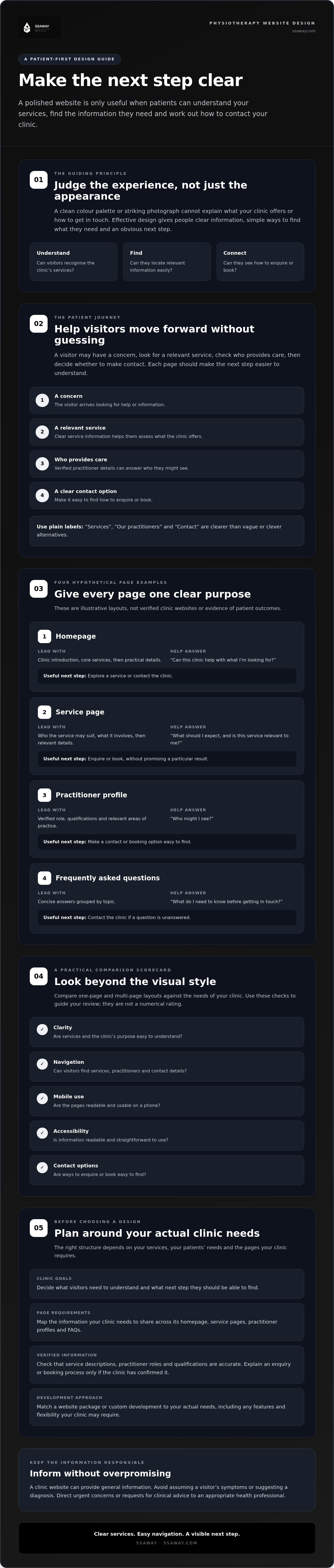
Consider the visitor’s sequence: they have a concern, look for a relevant service, check who provides care, then decide whether to make contact. Each page should help them move forward without making them guess. Labels such as “Services”, “Our practitioners” and “Contact” are clearer than vague or clever alternatives.
Make the clinic’s contact methods easy to find, and explain what happens after someone submits an enquiry or booking request, if the clinic has confirmed that process. Don’t assume a visitor’s symptoms or suggest a diagnosis. A website can provide general clinic information, but urgent concerns or requests for clinical advice should be directed to an appropriate health professional.
Review the experience from a patient’s point of view: can they recognise the service they need, and can they find who to contact? Clear answers make the site easier to use and help visitors decide on a next step.
Four physiotherapy website design examples, from homepage to service page
The examples below are hypothetical layouts, not verified clinic websites or evidence of patient outcomes. Use them to assess how each page helps a visitor find relevant information and decide what to do next.
Give every page one clear primary purpose so visitors know what it’s for and what step they can take next.
| Hypothetical page | Intended visitor and information order | Useful next action and likely question |
|---|---|---|
| 1. Homepage | A new visitor; clinic introduction, core services, then practical details. | Explore a service or contact the clinic. “Can this clinic help with what I’m looking for?” |
| 2. Service page | Someone considering a particular service; who it may suit, what it involves, then relevant details. | Enquire or book. “What should I expect, and is this service relevant to me?” |
| 3. Practitioner profile | A visitor who wants to know who may provide care; verified role, qualifications and relevant areas of practice. | Find a contact or booking option. “Who might I see?” |
| 4. Frequently asked questions | A visitor checking practical details; concise answers grouped by topic. | Contact the clinic if their question isn’t answered. “What do I need to know before getting in touch?” |
Example: a homepage that guides rather than overwhelms
Keep the opening focused: identify the clinic, introduce its core services and make the contact route easy to spot. Follow with a short set of service links and practical information. Descriptive headings and concise sections help visitors scan the page, especially on smaller screens. Avoid cramming every detail onto the homepage. Give each subject space on the page that best serves it.
Examples: service pages and practitioner profiles
A service page should explain who the service may suit, what it involves and how to enquire, without promising a particular result. A practitioner profile can help visitors understand who may provide care by stating the person’s verified qualifications, role and relevant areas of practice. Check every professional detail and health-related claim before publication. Don’t add credentials, treatment claims or outcomes simply to make a page sound more persuasive.
An FAQ page can cover recurring practical questions, but it shouldn’t guess at a visitor’s condition or replace professional advice. Check answers for accuracy and make it easy to contact the clinic when someone needs information specific to their situation.
These examples can help you map the content your clinic needs before choosing a structure. If you’re considering a packaged site, review website package options and compare them with your required pages and features.
How to compare physiotherapy website designs beyond appearance
A polished website can still be hard to use. Visual polish earns a glance; practical usability helps a visitor find information and take the next step. Compare physiotherapy website design with the same scorecard each time, rather than judging colour and layout alone.
- Clarity: Can a visitor quickly tell what the clinic offers?
- Navigation: Are service, practitioner and contact pages easy to find?
- Mobile use: Does the layout remain readable and usable on a phone?
- Accessibility: Are text and links clear, can the site be used with a keyboard, and do meaningful images have useful text alternatives? Use WCAG 2.2 Level AA as a benchmark when assessing accessibility.
- Contact pathways: Are the clinic’s contact options easy to locate and understand?
Does a one-page or multi-page physiotherapy site fit better?
Neither structure is automatically the better choice. A clinic with a focused service range might suit a one-page layout, with clear sections for services, practitioners and contact details. A clinic with distinct services and several practitioners may need separate pages so visitors can explore each topic without scrolling through one long page. For a closer look at simpler structures, read this one-page website guide for Aussie small businesses.
| Structure | Can suit | Check before choosing |
|---|---|---|
| One-page | A clinic with a compact, focused range of information. | Can visitors scan sections easily and reach contact details without excessive scrolling? |
| Multi-page | A clinic with distinct services, practitioners or plans for more detailed content. | Are page names clear, and can visitors move between related information without getting lost? |
Let information needs determine the page count. Consider not only today’s services, but also the content the clinic expects to add. More pages aren’t automatically more useful, and fewer pages shouldn’t force unrelated information together.
Which trust and accessibility details should you assess?
Check that practitioner names, qualifications, roles and areas of practice are accurate. Make contact details transparent and easy to find. Test links with a keyboard, check that link text describes where it leads, and ensure image alternatives convey useful information when an image matters.
For Australian clinics, check current AHPRA and Physiotherapy Board advertising guidance before publishing health-related claims. AHPRA’s guidance prohibits testimonials in advertising for regulated health services, so don’t treat patient reviews as standard website trust content. Keep claims accurate and avoid suggesting a particular outcome is certain.
A practical checklist for planning your physiotherapy website
A clear brief makes physiotherapy website design easier to assess. It keeps the scope tied to your clinic’s real needs, rather than features that only look impressive. Work through this sequence before choosing a layout or development approach.
- Set the audience and goals. Note the patient groups your clinic aims to serve and what visitors should be able to do, such as understand a service or make an enquiry.
- List services and common questions. Use verified service information and note the questions visitors often ask. This helps shape useful page content.
- Choose pages and features. List required pages, enquiry methods and any booking needs. Mark which existing content should be retained.
- Gather accurate materials. Prepare verified practitioner names, roles and qualifications, current contact information, service details and imagery approved for use.
- Separate essentials from extras. Identify what the site needs at launch, then list optional features separately. This makes the project scope easier to discuss and compare.
- Review before launch. Test the site on desktop and mobile, check content and contact details, then review accessibility and advertising claims with appropriate care.
What should a clinic include in its website brief?
Keep the brief specific. State whether visitors need separate service information, practitioner profiles or a booking pathway. Note what happens after an enquiry, but include only a process the clinic has confirmed. A simpler site may suit a narrow set of needs; a broader scope may require more pages or features. This affordable website design guide can help you think through scope and approach without treating every feature as essential.
Record who will check the final copy. Service descriptions, practitioner details and health-related claims should be verified before publication. Assigning responsibility for these checks helps avoid publishing outdated or unsupported information.
How can you check a design before launch?
Walk through the site as a visitor. Follow the navigation, submit each form, check contact details and make sure key pages load and remain usable on a phone. Review text size, link labels, keyboard access and meaningful image alternatives. If analytics or Google Search Console are being set up, confirm they’re configured appropriately and that applicable consent requirements have been addressed.
Once your page list and priorities are clear, compare them with SSAWAY’s website packages and custom development to see which approach may fit the scope.
Choosing a physiotherapy website design approach and next steps
The right physiotherapy website design approach depends on what your clinic needs now, which features are essential and how the site may need to change later. A package is worth assessing when your required pages and features fit a straightforward structure. If your requirements extend beyond that, custom development is an option to discuss. Neither choice is automatically better. The scope should fit the clinic, not the other way round.
When might a packaged site or custom development suit a clinic?
SSAWAY offers one-page, shopfront and e-commerce website packages, plus custom web development. Compare your page list and required features with the package details before deciding whether a packaged option fits. Confirm current inclusions rather than assuming a package covers a particular booking tool, page or function.
Custom development may be worth discussing if your requirements extend beyond a simpler structure. For either approach, ask how the agreed scope supports your current needs and whether it leaves room for the changes you expect. Get the details in writing.
SSAWAY requires no upfront payment. Clients review and approve the finished website before payment. Make sure you understand the review and approval process, along with what’s included, before work begins.
What should you ask a website designer before starting?
Clear answers help you compare options on more than appearance. Ask:
- Which pages and features are included in the agreed scope?
- Who supplies or checks the written content and practitioner information?
- How are revisions handled, and what counts as a revision?
- Who controls the domain, and who manages updates after launch?
- Which requested features need separate discussion or confirmation?
Before approaching a provider, prepare a short brief with your priority services, required pages, contact or booking needs, verified clinic information and any content you want to keep. Mark essentials separately from optional additions. This gives you a clear basis for comparing the proposed scope with your actual requirements.
If SSAWAY’s options are relevant to your brief, explore SSAWAY’s website design options. Review the package details against your page list, or ask about custom web development if your requirements call for a different structure. Confirm the scope before choosing.
Choose a website structure that works for your clinic
Effective physiotherapy website design puts patient needs first. Make services easy to understand, keep navigation straightforward and give visitors a clear way to enquire. Choose a one-page or multi-page structure based on the information your clinic needs to share, not appearance alone.
Use the examples and checklist to define your priorities before comparing website options. Confirm the pages and features you need, check that practitioner and service information is accurate, and test the finished design on mobile as well as desktop. A clear scope makes it easier to choose an approach that fits your clinic.
SSAWAY offers one-page, shopfront and e-commerce website packages, plus custom web development. There’s no upfront payment, and clients review and approve the finished website before payment. Explore straightforward website design options with SSAWAY and compare them with your brief.
Start with what patients need to know and do. A clear plan gives your clinic a practical direction and a useful next step.
Frequently Asked Questions
What should a physiotherapy website include?
A physiotherapy website should make services, practitioners and contact options easy to find. Include a homepage that introduces the clinic and its core services, service information that explains what each offering involves, accurate practitioner profiles, practical details and a clear enquiry or booking route, if applicable. FAQs can answer common logistical questions. Keep health information factual, check claims before publication, and make navigation easy to use on mobile.
How do I choose a design for a physiotherapy clinic website?
Choose a design that helps patients understand the clinic and find their next step, rather than choosing by appearance alone. Compare options for clear service information, straightforward navigation, mobile usability, accessibility and visible contact pathways. Check whether the page structure suits the clinic’s actual services and content. A useful design makes it simple to learn what the clinic offers and how to enquire, without crowding every detail onto the homepage.
Should a physiotherapy clinic use a one-page or multi-page website?
Choose a one-page site if the clinic has a focused range of information that visitors can scan easily in sections. A multi-page site may suit a clinic with distinct services, several practitioners or more detailed information to share. Neither structure is always best. Base the choice on what patients need to find now and what the clinic expects to add later. Keep navigation clear whichever structure you choose.
What makes a physiotherapy website trustworthy?
Trust starts with accurate, current information. Check practitioner names, qualifications, roles, service descriptions and contact details before publishing. Explain services plainly and avoid promising specific health outcomes. Australian physiotherapy advertising must follow current AHPRA guidance, including its restrictions on testimonials in advertising. Don’t rely on patient reviews or success stories as website trust signals. Clear explanations, honest claims and easy-to-find contact information give visitors a sound basis for deciding whether to enquire.
How can I make a physiotherapy website accessible?
Use WCAG 2.2 Level AA as a practical accessibility benchmark. Make sure text is readable, colour contrast is clear, links describe their destination and the site can be navigated by keyboard. Add meaningful text alternatives for images that convey information. Test forms and menus on mobile and desktop, and don’t rely on colour alone to explain important details. Accessibility checks should be part of planning and review, not a last-minute visual check.
What should I ask before hiring a website designer for my clinic?
Ask which pages, features, content tasks and revisions are included in the agreed scope. Clarify who supplies and checks content, who controls the domain, and who manages future updates. Confirm how you’ll review the finished site and when payment is due. It requires no upfront payment, and clients review and approve the finished website before payment.


