
A striking website can still leave visitors unsure what a business does or what to do next. For businesses searching for modern digital solutions, the strongest design isn’t necessarily the boldest or most elaborate. It’s the one that makes the offer clear and helps visitors take a useful next step.
Design inspiration is only useful when it translates into a site that works for your business. A polished look matters, but so do clear messages, sensible page layouts and visible actions. The right approach depends on what you offer and what visitors need to do, whether that’s enquire, browse services or buy a product.
This 2026 roundup compares practical website styles and explains where each can fit. You’ll see how layout, content and visual choices affect usability, plus what to prioritise before a project begins. SSAWAY’s one-page, shopfront and e-commerce packages offer different ways to put those principles into practice. You can review and approve the finished website before paying.
Key Takeaways
- Choose a design style that helps visitors understand what you offer and what to do next, not just one that looks appealing.
- Explore five approaches to web design brisbane and consider which visual direction suits your business and content.
- Compare one-page, shopfront and e-commerce structures based on your audience, content and main website goal.
- Turn inspiration into a useful brief by defining your audience, choosing a primary action and gathering your content before design begins.
- See how SSAWAY’s website options can put a suitable design direction into practice, with the chance to review and approve the finished website before payment.
What makes small business web design clear and useful?
A useful website gives visitors a clear path from what they need to the next helpful action. It explains what the business offers, helps people find relevant details, then makes it easy to enquire, browse or buy. Good web design isn’t decoration added to a business message. It gives that message a clear order and practical purpose.
Attractive design catches the eye; useful design helps visitors understand the offer and decide what to do next. Colour, photography and visual details should support that job, not compete with it. The Principles of Web Design bring together areas such as user experience and interface design, both useful lenses for planning a small business site.
Think of the page as a guided route. A clear heading establishes the main point. Supporting copy fills in the details. Navigation helps visitors move to another page without hunting. When each element has a purpose, the site is easier to follow.
What should a visitor understand at a glance?
Near the start of the page, make three things clear: what the business is, what it offers and who it helps. Visitors shouldn’t have to read several sections to work out whether they’re in the right place.
Use a direct heading, then add concise supporting copy that answers a likely question. For example, a bakery could lead with “Fresh bread and pastries baked daily”, followed by a short note about its range and where to find opening hours. The heading sets expectations; the next details help visitors decide where to go next.
Keep headings descriptive and paragraphs focused. A clear hierarchy helps people scan, while plain language makes important details easier to find. Navigation labels should name the content they lead to, such as “Services”, “Shop” or “Contact”. Avoid clever labels that leave visitors guessing.
How do layout and accessibility support usability?
Usability depends on more than tidy spacing. Text needs to be legible, colour contrast should keep words distinct from their backgrounds, and interactive elements such as buttons and links should be easy to recognise. Give each page a clear visual order, with the most important information first and supporting details grouped logically.
The layout should adapt to mobile, tablet and desktop screens. On a phone, visitors may need to scroll more, so keep headings clear, paragraphs manageable and key actions easy to spot. On a larger screen, use space to separate content rather than stretching long lines of text across the page.
Use the Web Content Accessibility Guidelines (WCAG) as a reference when planning accessible content and layouts. Treat accessibility as part of the design process, not a final layer of polish. The aim is to make the website easier for more people to read, navigate and use.
Five web design styles to consider for a small business website
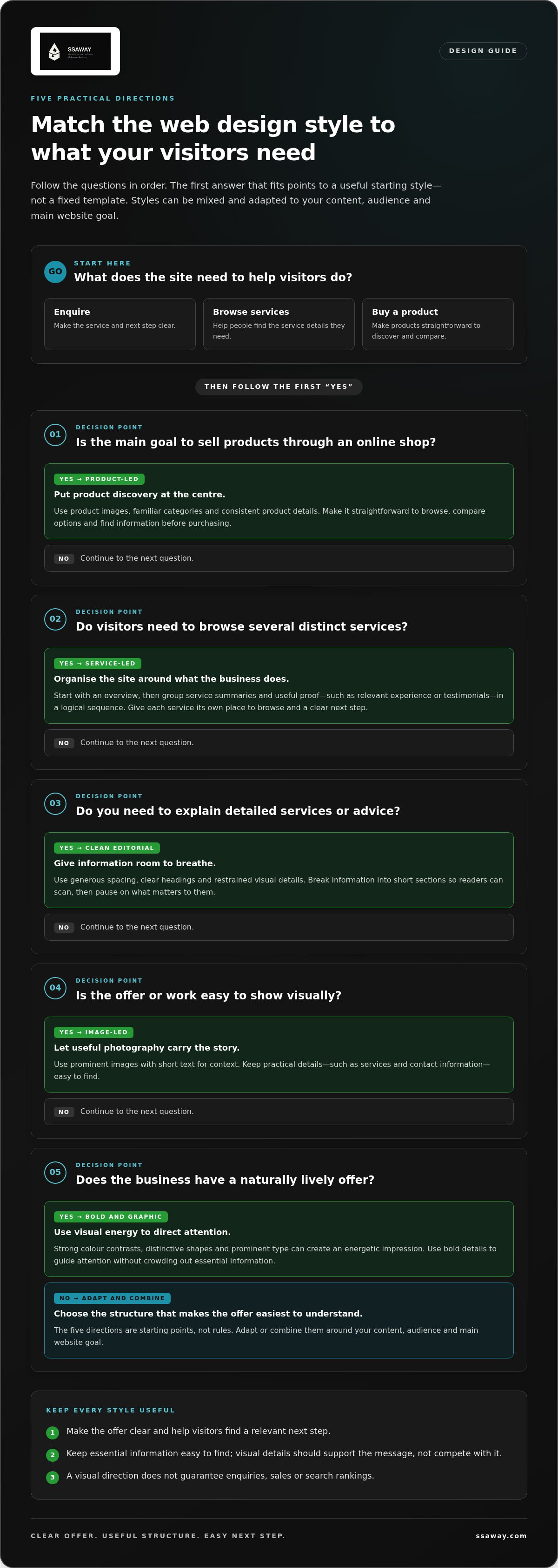
A design style is a starting point, not a rulebook. These five approaches can be mixed and adapted to suit your content, audience and main website goal. They’re ways to think about structure and presentation, not fixed templates or named SSAWAY products. For businesses comparing web design brisbane options, the practical question is: which approach makes your offer easiest to understand?
1. Clean editorial
Generous spacing, clear headings and restrained visual details give this style a calm, organised feel. It suits businesses with detailed services or advice to explain, such as an accountant outlining different types of support. Break information into short sections so readers can scan the page, then pause to read what matters to them.
2. Image-led
Large, prominent photography carries much of the story, with short text providing context. This can suit a café, accommodation business or maker whose work is easy to show visually. Choose images that help explain the offer, and keep practical details such as services and contact information easy to find.
3. Bold and graphic
Strong colour contrasts, distinctive shapes and prominent type create an energetic impression. This direction can suit a business with a naturally lively offer, provided the visual elements don’t crowd out essential information. Use bold details to guide attention to key content, rather than making every section compete for it.
4. Service-led
This approach organises the site around what the business does. Start with a clear overview, then group service summaries, useful proof such as relevant experience or testimonials, and contact prompts into a logical sequence. A shopfront structure can help visitors browse several services by giving each its own place in the menu. For example, a home maintenance business might group painting, repairs and inspections separately, with a clear next step on each page.
5. Product-led
Product images, categories and useful product details take centre stage. This style helps an online shop organise discovery, so visitors can browse by type, compare options and find the information they need before purchasing. Keep category names familiar and product details consistent. The layout should make browsing straightforward, not turn the page into a wall of competing choices.
No visual direction guarantees enquiries, sales or search rankings. Its job is to present the offer clearly and support the visitor’s next step. The Australian Government Guide to Business Websites is a useful reference for planning practical website features, including usability and mobile compatibility.
SSAWAY’s one-page, shopfront and e-commerce website options provide different structures for putting these ideas into practice. To explore a suitable website direction, view SSAWAY’s website options.
How to compare web design styles before choosing one
A visual style should fit your offer and the information visitors need, not just a look you like today. Start with the job the website must do. Then compare how each structure presents your content and guides visitors. Business goals should shape design choices, because the right layout makes the next useful step easier to find.
When does a one-page layout make sense?
A one-page layout can suit a focused offer that visitors can understand in a straightforward sequence. It keeps the key information together, from what you do to how to take the next step. It may become limiting if people need to browse many distinct services or products. For more on this structure, read the one-page website guide.
When should a business use a shopfront or e-commerce structure?
A shopfront structure can organise several services into separate, easy-to-scan sections, so visitors can go straight to what interests them. An e-commerce structure is built around product browsing and a clear route from category to product information and purchase. Choose based on what people need to explore, not only on which layout looks most striking. The e-commerce website packages guide covers how to think about that fit.
Use the comparison as a practical check: can visitors recognise where to start, find the information they need and take the intended action? If the structure makes those steps awkward, revisit the content and layout before settling on a visual direction.
A practical process for turning design inspiration into a website brief
Good references help, but they aren’t a brief. Turn ideas into decisions by working through five steps: define your audience, choose the main action, organise content, set a visual direction, then review the result. This keeps a web design project focused on what visitors need, not a collection of unrelated preferences.
What should go into a useful design brief?
Start with the essentials. Who is the website for? What does the business offer? What’s the most important action a visitor should take? Then note the pages or sections needed, the content you already have and any functions the site needs to support.
Gather existing copy, product information and useful images before design begins. This makes it easier to see what the site must accommodate and where information is still missing. Sort requirements into two short lists:
- Must-haves: essential pages, accurate service or product details, contact information and key functions.
- Nice-to-haves: features or visual flourishes that would be useful but aren’t essential to the main purpose.
Be specific about visual references. Instead of writing “modern” or “professional”, describe what you mean: open spacing, large product photography, clear headings or a limited colour palette. Those details give the design direction without locking you into copying another website.
How can you review a design without getting lost in details?
Review the page as a visitor would. Does it answer the main questions in a sensible order? Can someone find the right service or product without guessing? Check navigation, forms and other key actions on both mobile and desktop. A button that’s easy to spot on a large screen should still be clear on a phone.
Separate usability fixes from personal preferences. Incorrect details, hard-to-find information, unclear navigation or a form that doesn’t work are essential corrections. A small preference about spacing or colour may be worth discussing, but it shouldn’t distract from whether the page does its job.
Bring your audience, main action, content and visual references together in one short document. That’s enough to make design decisions clearer and keep the project grounded in real needs.
With SSAWAY, there’s no upfront payment, and you can review and approve the finished website before paying. Explore SSAWAY website options as a next step for putting your brief into practice.
How SSAWAY turns a suitable design direction into a working website
A design direction becomes useful when it shapes how the website is organised, what information visitors see first and how they take the next step. SSAWAY’s one-page, shopfront and e-commerce website options give businesses different structures to consider. The right fit depends on the offer and the content visitors need, not on a style trend alone.
Which SSAWAY website option fits the design direction?
A one-page website can suit a focused offer that’s easy to explain in a clear sequence. It brings key information together, which may work well when visitors have one main service or action to consider. It won’t suit every business, particularly where people need to browse many distinct offers.
A shopfront website can give multiple services clear space. Separate sections help visitors scan the range and find the details that matter to them. A service-led design can work well here: introduce the business, organise each offer, then make the relevant next step easy to find.
An e-commerce website is suited to businesses that need visitors to browse products and follow an online purchase path. Product-led design can bring categories and product information into a clear structure, helping shoppers move from discovery to decision. The visual style still needs to support that journey, rather than distract from it.
Some requirements call for a more tailored approach. SSAWAY also provides custom web development for website needs that don’t fit neatly into a standard structure. Consider the design direction alongside the specific content and functions the website needs.
What makes the project process straightforward?
There’s no upfront payment. Clients can review and approve the finished website before paying. This gives you a clear point to check whether the content, layout and visual choices reflect the intended direction before payment is made.
Use that review to look at the whole visitor journey, not just individual design details. Is the main offer clear? Can people find the right service or product? Is the next action easy to spot? These checks bring the project back to its purpose and help you assess the website as a working tool.
If you’re ready to put your design direction into practice, explore SSAWAY website design.
Turn your design direction into a useful website
The best web design brisbane choice is the one that makes your offer clear and helps visitors take the next step. A clean editorial, image-led or product-focused look can all work when the layout, content and visual details suit your audience. Start with what your website needs to do, then choose a structure that supports it.
A focused offer may suit a one-page website. Several services may need the clearer sections of a shopfront website. If customers need to browse products and buy online, an e-commerce website may be a better fit. A practical brief helps keep those decisions centred on your business, not passing design trends.
SSAWAY offers one-page, shopfront and e-commerce website packages with integrated SEO optimisation. There’s no upfront payment, and you can review and approve the finished website before paying. That gives you a chance to assess the completed site before payment.
Ready to take the next step? Explore SSAWAY website design and find a website direction that fits your needs.
Frequently Asked Questions
Is responsive web design important for a small business website?
Yes. Responsive design adjusts a website’s layout to suit mobile, tablet and desktop screens, helping visitors read content and use features on different devices. This matters when someone looks up your business while out and about. Check the site at smaller screen sizes: headings should remain easy to scan, navigation should be usable, and forms and buttons should be clear and straightforward to use.
Can a one-page website work for a small business?
Yes, if your business has a focused offer that visitors can understand in a simple sequence. A one-page layout can bring key information and a main action together. It may be less suitable if visitors need to browse many separate services, detailed information or a large product range. Choose the structure according to what people need to find and what you want them to do next.
How much content should a small business website include?
Include enough content to explain what your business does, who it helps and what visitors can do next. Organise information under clear headings and remove repeated points. A focused offer may need only a few sections, while a business with a wider range of services may need separate pages or sections. The aim is to make relevant details easy to find without asking visitors to sift through everything at once.
What makes a business website look professional?
A professional website presents information consistently and is easy to use. Clear headings, readable text, suitable images, consistent spacing and working navigation all help. The design should support your business message, not hide it behind visual effects. Review the site on both mobile and desktop, and check that contact details and key actions are easy to find. Clear presentation builds confidence without needing unnecessary decoration.
Should my website design focus on visuals or usability?
Both matter, but usability should guide the visual choices. Images and colour can help explain your offer, while clear structure, readable content and visible actions help visitors use the site. Start by deciding what people need to understand and do. Then choose visual elements that support that path. For web design brisbane, as anywhere, a striking look only works if visitors can still find the information they need.
Can I review a website before paying SSAWAY?
Yes. SSAWAY doesn’t require upfront payment, and you can review and approve the finished website before paying. Use that review to compare the website with the intended direction. Check that the content is clear, navigation makes sense, and key actions work as intended. This gives you an opportunity to assess the completed website before payment, rather than paying upfront and hoping the result matches your expectations.


