
For modern web design, the most useful trend in 2026 may be one visitors barely notice: a clear menu, quick-loading pages and readable text. SSAWAY understands that these basics can do more for your business than flashy effects or clever animations.
It’s understandable to wonder which trends are genuinely useful. A dated or confusing website can make it harder for people to find what they need, while following every new visual fashion can add complexity without improving the experience. The goal isn’t to make your site look different for its own sake. It’s to make it work better for the people using it.
This guide covers practical design choices that can make a business website clearer and easier to use, and how to tell them apart from visual noise. We’ll look at accessibility, mobile-friendly layouts, page speed, motion and AI, then explain how to prioritise improvements without automatically committing to a full redesign.
Key Takeaways
- Judge a design trend by whether it solves a real visitor problem, not just by how current it looks.
- Prioritise responsive layouts, accessible controls and faster pages to make your website easier to use.
- Use AI, personalisation and motion only when they add clear value without creating extra friction.
- For web design sydney, focus first on changes that support your visitors and business goals.
- Choose a website format that fits your content and customer journey, then refine it around your priorities.
Web design trends in 2026: start with what visitors need
A web design trend is useful when it makes a visitor’s experience clearer, easier or more accessible. A look can be popular and still make a website harder to use, so judge trends by what they help people do.
Business owners can feel pressure to adopt each new layout, effect or feature to keep a website looking current. But a visual refresh isn’t automatically an improvement. Before adopting a trend, ask whether it improves clarity, accessibility or usability, and whether the business can maintain it over time. When comparing web design sydney ideas with your own plans, start with what your visitors need.
This gives you a straightforward way to assess ideas. Responsive layouts, for example, adjust to different screen sizes so content remains usable across devices. By contrast, a decorative effect that slows down a key task or makes text harder to read needs a strong reason to stay.
What makes a web design trend worth adopting?
A lasting usability improvement helps visitors complete a task. Readable text helps them understand your offer. Clear navigation helps them find the right page. A visible call to action shows them what to do next. These choices may not look dramatic, but they reduce guesswork.
A decorative trend can still suit a business, but it shouldn’t compete with the basics. If an animation distracts from important information or an unusual menu makes familiar pages difficult to find, the style is getting in the way.
A useful web design trend makes it easier for visitors to understand, navigate or use your website. If it doesn’t do one of those things, it may be visual noise rather than a priority.
Why should a business website evolve?
Customer expectations and browsing habits change. People may visit on phones, use different screen sizes or expect to find key details without digging through several pages. A website that once felt straightforward can become harder to use as its content, features or audience needs change.
Look for specific points of friction. Is important information buried? Do page labels make sense to someone unfamiliar with your business? Does a control rely on hovering, which doesn’t translate well to touchscreens? These obstacles can leave visitors unsure where to go or what to do.
That doesn’t mean rebuilding everything. Keep what still works, and update what creates confusion, blocks access or adds needless upkeep. A business website should evolve with its visitors, not chase every new style.
Responsive layouts, accessible design and faster page experiences
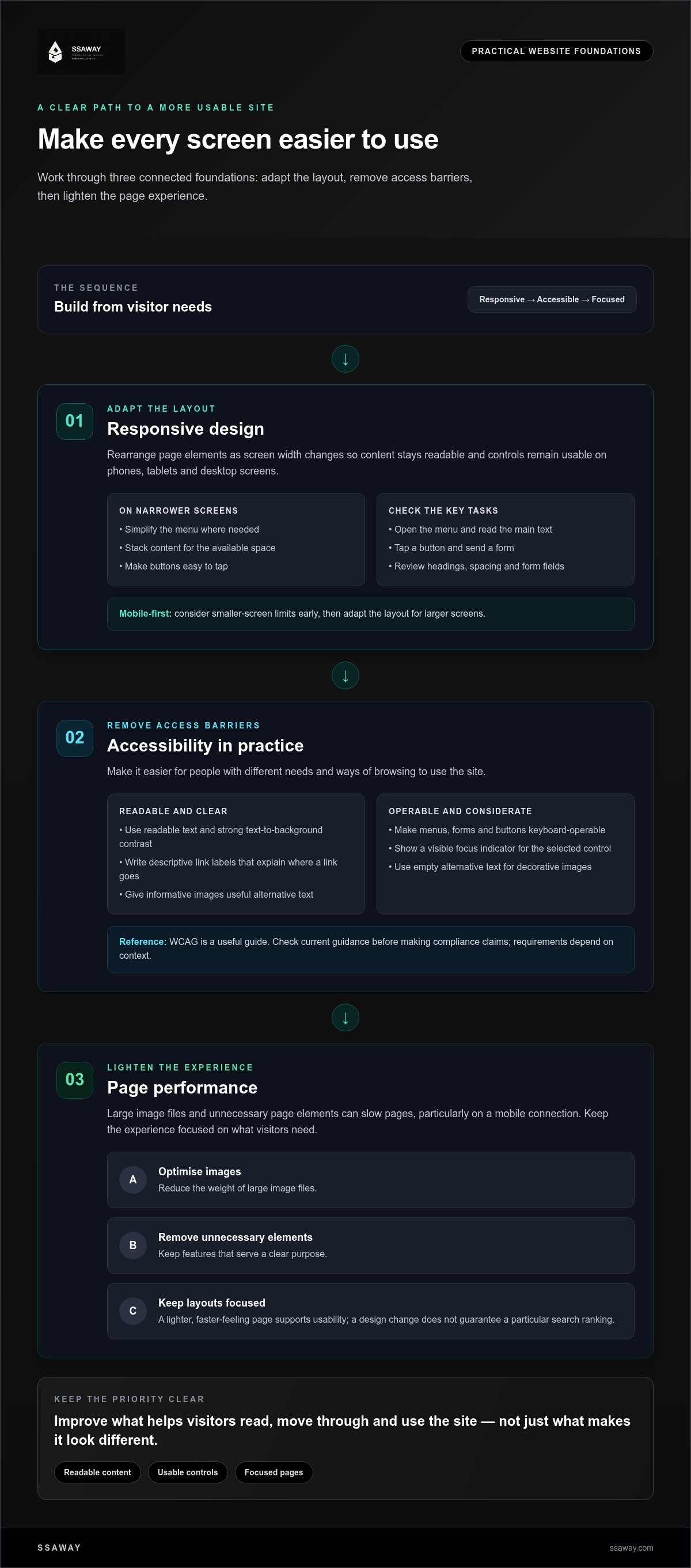
A website should work on the screen a visitor has, not only the one used to build it. Responsive design rearranges page elements as screen width changes, so content remains readable and controls usable on phones, tablets and desktop screens.
Responsive design adapts a website’s content and layout to different screen sizes, without making visitors pinch, zoom or hunt for key actions. That’s more than shrinking a desktop page. A narrow screen may need a simpler menu, stacked content and buttons that are easy to tap.
How does responsive web design help mobile visitors?
Start by checking the tasks visitors need to complete. On a phone, can they open the menu, read the main text, tap a button and send a form without awkward scrolling or mis-taps? Check headings, spacing and form fields too. A layout can technically fit a small screen and still feel cramped or confusing.
A mobile-first approach considers those limits early, then adapts the layout for larger screens. It also supports a broader principle: the W3C’s design guidance encourages people to start with what visitors need, rather than forcing them to work around the interface.
What do accessibility and performance look like in practice?
Accessibility makes it easier for people with different needs and ways of browsing to use a site. Use readable text, strong contrast between text and its background, and descriptive link labels that explain where a link goes. Make sure menus, forms and buttons can be operated with a keyboard, with a visible focus indicator showing which control is selected.
Images need useful alternative text when they communicate information. Decorative images can use empty alternative text so they don’t add noise for people using screen readers. The Web Content Accessibility Guidelines (WCAG) are a useful reference for accessibility practices. Check current guidance before making claims about compliance, as requirements depend on context.
Performance is part of usability too. Large image files and unnecessary page elements can make pages slower to load, particularly on a mobile connection. Optimise images, remove features that don’t serve a clear purpose and keep page layouts focused. Faster, lighter pages feel more responsive, but don’t assume a design change guarantees a particular search ranking.
For a web design sydney project, these foundations are practical priorities, not add-ons. They help visitors read, move through and use the site with less friction. If you’re planning an update, explore website design options that fit your business needs.
Personalisation, motion and AI: weigh the benefits against the friction
Interactive features can make a website feel more engaging, but they also add decisions, work and potential points of failure. Judge each one by its purpose and its effect on visitors. Does it help someone understand an offer, find relevant information or complete a task? If the benefit isn’t clear, keep the experience simple.
- Motion: Can show that a menu has opened or draw attention to a change. It needs careful design and testing, especially if movement distracts from reading or delays interaction.
- Personalisation: Can bring relevant information forward for different visitor needs. It may require extra content and decisions about what information is used.
- AI-assisted features: Can help organise content or support a defined task. They need oversight to catch inaccurate answers, confusing wording or information that shouldn’t be displayed.
When do animation and interactive elements improve a site?
Use animation to explain, guide or confirm. A subtle transition can show that a button has been selected, while movement can help reveal how an interface works. But effects that keep moving, compete with text or slow down a page can get in the way. Respect reduced-motion preferences, and test essential tasks with motion enabled and reduced. Menus, forms and key actions should remain clear either way.
Where can AI and personalisation fit into web design?
Personalisation may help visitors see information that fits their needs, while AI can assist with organising site content or answering common questions. Neither is automatically useful. Added features can make a site harder to maintain, and generated content can be wrong or out of date. Have a person review it before it reaches visitors.
Consider privacy, too. Tailoring content may involve using information about a visitor, so be clear about what the feature does and avoid collecting details that aren’t needed. If a straightforward page already answers the visitor’s question, personalisation may add effort without adding value.
Before adding a feature, write down the visitor problem it should solve. Then decide what success would look like in practical terms, such as making a key answer easier to find. Test it against real tasks. If it creates more steps, distraction or upkeep than it removes, leave it out. Good web design isn’t measured by how much technology a page contains. It’s measured by how well the page helps people use it.
How to choose web design trends that fit your business website
You don’t need to rebuild your whole website to make it more useful. Start with a specific visitor problem, choose a change that addresses it, then test whether it helps. This keeps decisions grounded in what people need, not what happens to be fashionable.
- Find the friction. Identify a page or task that causes confusion. Can visitors find your services? Is an important button hard to spot? Does a form feel awkward on a phone?
- Choose a relevant change. Improve the part that’s getting in the way. Clearer labels, shorter content or a more visible next step may matter more than a new visual effect.
- Test before expanding. Check the change on mobile and desktop. Try the key task yourself, then gather feedback from visitors where you can. Keep it if it makes the task easier; adjust it if it adds friction.
How can you prioritise changes without redesigning everything?
Pick one high-friction page or task first. Essential improvements include clear navigation, useful content and accessible controls. A new colour treatment or animation is optional if the basics still need work. Make a planned change, test it against the original problem, then decide whether it’s worth applying elsewhere. For a wider refresh, use this website redesign guide to consider the scope before you start.
Keep the review practical. Open the site on a phone. Find a key piece of information. Follow the steps a customer would take to enquire or buy. Note where you hesitate, scroll back or tap the wrong thing. Those observations can help you choose the next improvement without changing everything at once.
Which website format suits the content and customer journey?
The right format depends on what visitors need to understand or do. A focused one-page site may suit a simple offer or service that can be explained clearly in one place. See this guide to one-page website packages for more on that approach.
A shopfront website can organise information such as service details, frequently asked questions and contact options across clear pages. If customers need to browse products and buy online, an e-commerce site can support that journey. Explore e-commerce website packages to understand what to consider.
Choose a format that fits your content and customer journey, then make improvements within that structure. If you’re ready to plan a website around your visitors’ needs, explore website options with SSAWAY.
A practical way to put web design trends into action with SSAWAY
A clear brief turns design ideas into a website direction with a purpose. It helps separate what visitors need from features that simply look new. Start with the people you want to reach and what you want them to be able to do. Then choose a website structure and design priorities that support those goals.
What should a website brief explain?
Keep it practical. A useful brief covers:
- Audience: Who needs the information or service?
- Purpose: What should the website help the business communicate?
- Visitor actions: Should people enquire, browse services or buy products?
- Content and functions: What information and features are essential for those actions?
- Design priorities: Which improvements matter most, such as clearer navigation or easier reading?
Separate must-haves from optional ideas. For example, clear service information may be essential, while animation can be a later consideration. This gives the project a defined scope and makes it easier to judge whether a trend belongs in the design.
How does SSAWAY make the project decision clearer?
The right website type depends on what the business offers and what visitors need to do. A one-page website can bring a focused offer or service together in one place. A shopfront website can organise information about a business, its services and how to get in touch. An e-commerce website is suited to presenting products for customers to browse and purchase online. For needs that call for a more tailored build, SSAWAY also offers custom web development.
SSAWAY’s one-page, shopfront and e-commerce website packages include SEO optimisation. These formats give you a starting point, while the brief helps shape content, functions and design choices around your priorities rather than adding features without a clear reason.
All projects are priced under A$1,000, with no upfront payment required. Clients can review and approve the completed website before making payment.
You don’t need to adopt every trend or decide everything at once. Start with the visitor experience you want to improve, then explore the website format that fits. Explore SSAWAY website options and take a practical next step for your business.
Make your next website change count
A useful website doesn’t need every new visual trend. It needs to help visitors find information, understand what you offer and take the next step. For web design sydney, apply the same test: focus on changes that improve clarity, accessibility or ease of use, then assess them against a real visitor task.
The right website structure matters too. A one-page, shopfront or e-commerce website should fit your content and the way customers interact with your business. SSAWAY’s website packages include SEO optimisation, and you can review and approve the completed website before payment.
Start with the page or task that needs attention, then decide what would make it simpler for visitors. Explore SSAWAY website options and take the next step when you’re ready.
Frequently Asked Questions
What are the biggest web design trends in 2026?
Useful 2026 web design trends focus on making websites easier to use, not just more striking to look at. Responsive layouts, accessible design and faster page experiences remain practical foundations. Personalisation, motion and AI-assisted features can also have a place when they solve a clear visitor problem. A business doesn’t need to adopt every trend. Prioritise changes that help people find information and complete key tasks.
Is responsive web design still important for Australian businesses?
Yes. Responsive design helps a website work across phones, tablets and desktop screens. It adapts page elements to different screen sizes rather than simply shrinking the desktop layout. Check the menu, text, forms and buttons on a small screen. Visitors should be able to read content and complete essential tasks without excessive zooming, awkward scrolling or mis-taps. Responsive design is a basic part of a usable website.
How can I tell whether a web design trend is right for my business?
Choose a trend only if it helps solve a real visitor problem. Start by identifying a task that feels confusing or difficult, such as finding service information or sending an enquiry. Then choose a relevant change and test it on mobile and desktop. Ask visitors for feedback if practical. If the change adds distraction or makes the task harder, it’s not the right fit.
Can AI improve a business website's design and user experience?
AI can support a better website when it helps with a defined task, such as organising content or making useful information easier to find. It won’t automatically improve the visitor experience or search visibility. Review AI-generated content for accuracy and clarity before publishing it, and consider privacy if a feature uses visitor information. If a straightforward page already meets people’s needs, adding AI may create unnecessary complexity.
What makes a website accessible and easy to use?
An accessible, easy-to-use website has readable text, clear navigation and controls visitors can operate in different ways. Use strong colour contrast, descriptive link text, and keyboard-accessible menus and forms. Provide useful alternative text for informative images. Keep pages clear and test common tasks on different screen sizes. The Web Content Accessibility Guidelines (WCAG) offer a useful reference for accessibility practices; check current guidance before making compliance claims.
How often should a business update its website design?
There’s no fixed schedule that suits every business. Review your website when its content, services or customers’ needs change, or when visitors struggle to complete important tasks. Check key pages on mobile, test enquiry or purchase steps, and look for outdated information or confusing navigation. Make focused updates where needed. A full redesign isn’t necessary if smaller changes can address the problem.
Does a website need animation to look modern?
No. A website can look current and professional without animation. Use movement only when it helps explain a change, guide attention or show that an interaction has happened. Avoid effects that distract from reading, slow down a task or make navigation harder. Consider visitors who prefer reduced motion, and test key actions with animation both enabled and reduced. Clear content and usable controls matter more than decorative effects.


