
When researching modern web design options, it’s worth looking beyond the first impression. A polished page can still leave visitors unsure what you do, where to click or how to get in touch. Design works when it makes the next step clear.
It’s frustrating when a site looks impressive but feels awkward on a phone, hides useful information or doesn’t build trust. In 2026, useful choices matter more than passing trends. This guide shares seven practical website design ideas, plus a checklist to help you review your current site or plan a new one.
We’ll look at clear messaging, mobile usability, accessible layouts, speed and trust signals, and how to tell whether a design choice helps real visitors. You’ll also see how a one-page, shopfront or e-commerce website can suit different business needs. With SSAWAY, you can review and approve your finished website before payment, so you can assess the result before paying.
Key Takeaways
- Good web design helps visitors understand what you offer and what to do next, not just admire the page.
- Explore seven practical ideas that make business websites easier to navigate, read and use.
- Use website examples as references, then judge them by how well they serve your audience and purpose.
- Review your site with a clear checklist covering first-screen messaging, mobile usability and contact paths.
- See how a one-page, shopfront or e-commerce website can suit different business needs, with custom development for more tailored requirements.
What effective web design delivers beyond a polished first impression
A website can look polished and still leave visitors wondering what the business does, whether it suits them or what they should do next. Attractive colours and striking images may catch the eye, but they can’t make up for unclear information or awkward navigation. Good design makes the useful parts easy to find.
Effective web design presents information clearly and accessibly, helping visitors find what they need and take a sensible next step. It brings visual appeal together with usability, trust and a smooth experience across devices. If one of those parts is missing, the site may look finished without helping its audience.
Web design supports a visitor’s task by making information easy to understand, choices easy to compare and the next step easy to take. Use that as a practical test: does each design choice help visitors, or is it there only to look impressive?
How design helps visitors understand a business
Start with the first screen. A new visitor should quickly be able to identify the business, understand what it offers and see who it helps. A vague headline may sound polished but tell people very little. Plain language gives them a reason to keep reading.
Make the rest of the page easy to scan, too. Clear headings, short sections and a consistent structure help visitors find details without reading every line. Relevant images can show a product, service or real working environment. Use them to support the words, not simply to fill empty space.
Why a website should work beyond its first impression
Visitors may arrive on a phone, tablet or computer. A layout that only works well on a large screen can make people on smaller screens pinch, zoom or hunt for buttons. Responsive Web Design describes an approach that adapts a site’s layout to different screen sizes, helping keep content usable across devices.
Access matters, too. Readable text, strong contrast and controls that are easy to select help people use a site in different conditions and with different needs. These aren’t decorative extras. They make information easier to reach for a broader audience.
Finally, make the next step visible. If visitors can’t find how to enquire, book or buy, even a clear page can leave them stuck. Put the relevant action where it makes sense in the journey, and label it with specific words such as “View products” or “Send an enquiry”, rather than a vague “Click here”.
Try a simple test: show the opening screen to someone unfamiliar with the business, then ask what it offers and what they’d do next. If they hesitate, the answer may not be another visual flourish. It may be a clearer message, a more useful page structure or a more obvious action. That’s the difference between design that merely looks good and design that helps people move forward.
Seven practical web design ideas that make business websites easier to use
Useful design isn’t about adding every new feature. It’s about removing friction when visitors need to understand, compare or act. These seven ideas address common needs, from finding the right page to feeling confident enough to enquire. For wider context on emerging approaches, explore our 2026 web design trends guide, then judge each idea by whether it helps your audience.
Design choices that improve clarity and navigation
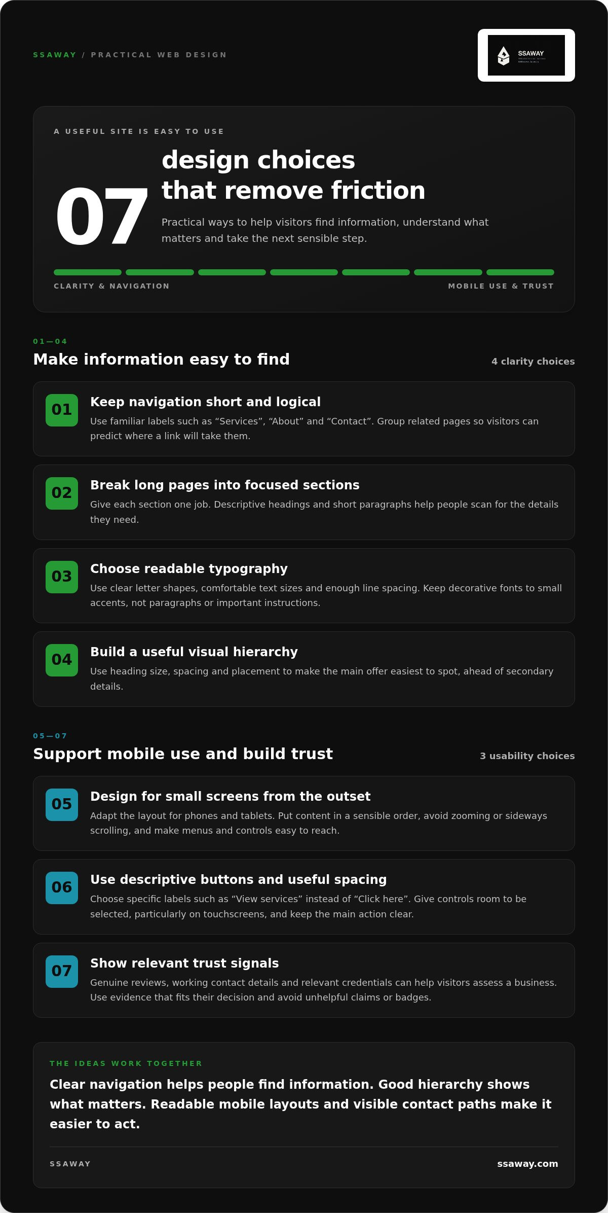
- Keep navigation short and logical. Use familiar labels such as “Services”, “About” and “Contact”. Group related pages under a clear heading instead of filling the menu with every detail. Visitors should be able to predict where a link will take them.
- Break long pages into focused sections. Give each section one job, such as explaining a service, answering a common question or showing how to get started. Descriptive headings and short paragraphs help visitors scan for the details they need.
- Choose readable typography. Use clear letter shapes, comfortable text sizes and enough spacing between lines. Decorative fonts can work for small accents, but they’re harder to read in paragraphs or important instructions.
- Build a useful visual hierarchy. Make the most important information easiest to spot through heading size, spacing and placement. Visitors should notice the main offer before secondary details, without having to decode competing colours or oversized elements.
Design choices that support mobile use and trust
- Design for small screens from the outset. Make sure the layout adapts to phones and tablets, with content in a sensible order and no need to zoom or scroll sideways. Check that menus open clearly and important controls are easy to reach.
- Use descriptive buttons and useful spacing. A label such as “View services” tells visitors more than “Click here”. Give buttons enough room to be easy to select, particularly on touchscreens. Keep the main action clear rather than surrounding it with competing prompts.
- Show relevant trust signals. Genuine reviews, working contact details and relevant credentials can help visitors assess a business. Choose evidence that fits the decision they’re making, and present it clearly. Avoid claims or badges that don’t add useful information.
These ideas work together. Clear navigation helps people find information; good hierarchy shows what matters; readable mobile layouts and visible contact paths make it easier to act. You don’t need to apply every design trend. Start with the parts of your site that make visitors pause, then prioritise the change that removes the most confusion.
If you’re planning a new site around these principles, compare the website options from SSAWAY with your business needs. A one-page site can bring essential information together, while a shopfront or e-commerce site can organise products for browsing and purchase. Custom development can support more tailored requirements.
How to compare website design examples without copying their look
A website example can spark ideas, but copying its colours, layout or animations doesn’t mean those choices will work for your business. The original site may serve a different audience, sell a different offer or guide visitors towards a different action. Treat examples as references: borrow the thinking behind a design choice, then check whether it fits your purpose.
For a useful comparison, look past the visual style. Ask whether the site explains its offer, makes key information easy to find, works on a phone, builds trust and gives visitors a clear next step. This is more useful than simply deciding whether a design looks modern. It helps you identify choices worth adapting before changing your own site.
A simple framework for reviewing design examples
Start with the opening screen: can you tell who the business serves and what it offers? Then explore the main pages on desktop and mobile. Look for clear routes to important information, readable content and buttons or forms that explain what happens next. For a fair comparison, assess each site using the same questions and your audience’s needs.
- Clarity: Is the purpose and intended audience apparent without searching?
- Navigation: Can you find a key service, product or contact page without guessing?
- Mobile usability: Does the content fit the screen, with controls that are easy to use?
- Trust and action: Are useful trust cues visible, and is the next step straightforward?
A quick side-by-side check makes the difference between helpful design and decoration easier to see:
| Visitor-focused choice | Purely decorative choice |
|---|---|
| A clear heading that explains the offer | A clever slogan that leaves the offer unclear |
| A menu organised around visitor needs | Unfamiliar labels chosen to look distinctive |
| A visible button labelled “Request a quote” | An eye-catching button labelled “Discover” with no clear destination |
| Reviews or contact details placed near a decision point | Decorative badges or effects with no useful context |
Not every decorative choice is wrong. Appearance should support the visitor’s task. If an animation, unusual font or large image makes information harder to find, it may be getting in the way. Explore this practical small-business design roundup for more examples to assess through the same lens.
When a simple layout or richer site structure fits better
Match the page structure to the information people need. A focused landing page can suit a single offer with one main action. If visitors need to compare several services or products, separate, clearly organised pages can make each choice easier to understand. The right structure depends on the task, not on how many pages another business has.
As you plan your website, use examples to collect ideas, not instructions to copy. Note what helps you understand and act, then decide whether your audience needs the same thing. A simple sketch of the key pages and the action each should support can turn inspiration into a practical design plan.
A practical web design checklist for reviewing your business website
Before changing your website, find out what’s getting in the way. A short review can show whether visitors struggle to understand your offer, use the site on a phone or get in touch. Fix the barriers first. A new colour palette or extra feature can wait if people can’t complete a basic task.
Every business website should pass five checks: clear purpose, easy navigation, readable mobile pages, usable speed and a visible path to enquire or buy. Work through this list on a computer and a phone, noting the specific issue instead of jumping straight to a redesign.
Five checks to make on desktop and mobile
- Check the first screen. Open the homepage as if you’ve never seen the business before. Can you tell what it offers and who it’s for? If the headline is vague, note what a new visitor might still need explained.
- Follow the navigation. Find a key service or product page, then look for contact details. Are the menu labels clear? Do links lead where you expect? Record dead ends, repeated steps or important pages that are hard to locate.
- Read the site on a phone. Check whether text is comfortable to read without zooming. Open the menu, tap buttons and try any forms. Look for cramped controls, content that runs off-screen or fields that are difficult to complete.
- Check how pages load. Open key pages on a phone using the connection you’d normally browse with. Notice long waits, content that jumps around or large elements that delay access to the main information. Page speed is part of usability, especially when someone is trying to act quickly.
- Complete a visitor’s likely task. Follow a realistic path from the homepage to an enquiry or purchase. Check that the action is visible, the button label is specific and the form or checkout makes the next step clear. If anything feels confusing, note where and why.
Turn review findings into a focused update plan
Group your notes under four headings: clarity, usability, trust and technical performance. Mark issues that block a key task as urgent. For example, a broken enquiry form or a menu that can’t be used on mobile needs attention before a minor colour adjustment. Keep visual refinements on the list, but don’t let them outrank a broken visitor journey.
Choose a small number of changes that address the clearest problems, then test them on both screen sizes. You may only need to rewrite a heading, simplify a menu or make a contact button easier to spot. A complete redesign isn’t the automatic answer. The aim is to make important tasks easier with the least unnecessary change.
Use your review as a practical starting point for a new or updated site. Explore website design options that match your business needs, from a focused one-page website to a shopfront, e-commerce site or custom development.
How SSAWAY makes practical web design easier to get started with
You’ve now got a way to judge what a website needs to do. The next step is matching the format to the job, not adding pages or features for their own sake. SSAWAY offers website options from a focused one-page site to e-commerce and custom development, so you can start with your visitors’ needs in mind.
Match the website format to the job it needs to do
Think about the information people need and what you want them to do. A compact site may be enough for a straightforward offer. A broader range of services or products may need more room and structure. SSAWAY’s website options include:
- One-page websites for bringing a compact business presence together in one focused page, with key information arranged in a clear flow.
- Shopfront websites for presenting services and business information across a structured website, so visitors can explore what you offer.
- E-commerce websites for businesses that need to present products for customers to browse and purchase online.
- Custom web development for projects that need a more tailored approach to their requirements.
When planning web design gold coast options, begin with the visitor’s task. Do they need a quick overview, details about several services or a way to browse products? Let that answer guide the structure.
A clear project model that reduces commitment anxiety
Starting a website project can feel uncertain if you’re expected to pay before seeing the finished work. With SSAWAY, there’s no upfront payment. You review and approve the completed website before payment is made. That gives you the chance to assess the result against the needs you identified.
This process applies to custom development as well as website packages. The project can be shaped around what the site needs to do, while the review-before-payment approach stays clear. You can assess the finished website before you pay.
SSAWAY website packages include SEO optimisation. This supports the site’s search foundations, but it isn’t a promise of rankings or a set amount of traffic. Clear page structure and useful content still matter. SEO is part of building a practical website, not a substitute for making it easy to understand and use.
You don’t need to settle every design detail before exploring your options. Start with the purpose, the pages or products visitors need, and the main action you want them to take. Then choose a format that fits.
If you’re ready to take a low-pressure next step, explore SSAWAY website design and find an option that fits the work your site needs to do.
Make your next website decision a practical one
Your next step doesn’t need to be a full redesign. Choose one visitor task that matters, such as understanding your offer or reaching the right page. Then make the change that makes that task simpler. A focused improvement gives you a clear place to start and a way to judge whether the site is easier to use.
Good web design gold coast decisions come from matching the site to real customer needs, not chasing every visual trend. Keep your review notes handy as you plan. They’ll help you explain what the website needs to do and what a useful result should look like.
If you’re ready to turn that plan into a website, explore SSAWAY website design options. Start with a clearer idea of what your business and its visitors need.
Frequently Asked Questions
What should a good business website include?
A good business website should give visitors the information they need to decide whether to take the next step. Include a clear description of what you offer, who it’s for, how to enquire or buy, and useful evidence such as genuine customer feedback. Keep details current, too. If your opening hours, services or product range change, update the relevant page so visitors aren’t relying on old information.
Is mobile-friendly web design still important in 2026?
Yes. Visitors may use a phone to check your details, compare products or send an enquiry, so those tasks need to work on a small screen. Test the actions that matter: can someone tap your phone number, read a product description and submit a form without zooming? For web design gold coast searches, as for any website project, the mobile experience should make everyday tasks straightforward.
How much does web design cost for a small business?
It depends on the site format, the amount of content and whether the project needs custom development. A focused one-page site has a different scope from an online shop with multiple products. SSAWAY offers fixed-price website options, including one-page, shopfront and e-commerce packages, alongside custom web development. Its projects are priced under A$1,000, with no upfront payment required. Compare what the project needs to do, so you’re judging the scope as well as the design.
Can I approve a website before paying for it?
Yes. SSAWAY doesn’t require upfront payment, and you review and approve the finished website before payment. Use that review to check the details that matter to your business: are the page names accurate, do the links work, and can visitors complete the main task? You can assess the actual site rather than relying only on a description of what it might look like.
Does a business website need SEO built into its design?
It helps to consider SEO as the site is planned rather than treating it as an unrelated extra. Clear page titles, descriptive headings and well-organised content can help search engines understand what each page covers. SSAWAY website packages include SEO optimisation. That supports a site’s search foundations, but it can’t guarantee a particular ranking or amount of traffic.
How do I know whether my website needs a redesign?
A redesign may be worth considering if the site no longer reflects your business, key pages are difficult to use, or visitors can’t complete an important task. First, check whether a targeted update would solve the issue. For example, correcting outdated service details or repairing a broken enquiry path may be enough. A wider redesign makes more sense when problems affect the site’s structure or several key tasks.
Should I choose a one-page website or a multi-page website?
Choose a one-page website if your offer is compact and visitors can understand it without separate sections for different services or products. A multi-page site is more suitable when people need to explore distinct offers, compare options or find detailed information. Think about what a customer needs to know before taking action. If fitting everything onto one page would make it crowded, separate pages may be clearer.


